New York, NY
moxie poe usability study
Project Overview:
The Moxie Poe Website project aimed to craft an immersive and user-friendly online space for the up-and-coming music artist, Moxie Poe, based in the vibrant city of New York. Our primary objective was to provide seamless accessibility to key information, including tour dates, contact details, and exclusive merchandise, catering to a dynamic user base aged 16-30 with a keen interest in independent music artists.
Problem:
Moxie Poe's existing website suffers from navigation inefficiencies, creating obstacles for her diverse fanbase to access crucial information. The lack of clarity in presenting essential details, such as tour dates, contact information, and exclusive merchandise, hampers the overall user experience. The current design fails to cater to the dynamic needs of the audience aged 16-30, limiting engagement and hindering the growth of Moxie Poe's online presence.
Goal:
The primary objective of the Moxie Poe Website Redesign is to create an immersive and user-friendly online space that seamlessly addresses the existing navigation challenges. The goal is to enhance the website's accessibility, ensuring that users, particularly those aged 16-30 with a keen interest in independent music, can easily find and engage with key information. This redesign aims to provide a streamlined and inclusive experience by implementing responsive design principles, integrating an efficient merch checkout page, and optimizing the presentation of tour dates, contact details, and band-related updates. Ultimately, the goal is to strengthen the connection between Moxie Poe and her fanbase, fostering a vibrant online community and propelling her music career forward.
Key Features:
-
Tour Dates at Your Fingertips: A carefully designed calendar ensures users can effortlessly stay up-to-date with Moxie Poe's latest tour schedule, creating anticipation and engagement.
-
Connect with Ease: Streamlined contact information allows fans, collaborators, and media outlets to connect seamlessly with Moxie Poe, fostering a sense of community and accessibility.
-
Exclusive Merchandise Showcase: An engaging display of merchandise creates an online storefront, offering fans the opportunity to support Moxie and rock their style with exclusive gear.
Target Audience:
Our target demographic includes individuals aged 16-30 who share a passion for discovering and supporting emerging talents in the independent music scene. By understanding their preferences and online behavior, the website design caters to their expectations and provides an immersive experience reflective of Moxie Poe's artistic identity.
Project Duration:
2023
Role:
Lead UX Designer, UI Designer, UX Researcher
Responsibilities:
User Research, paper and digital wire-framing, low and high fidelity prototyping, accounting for accessibility, conducting usability studies, iterating on designs.
user research
I have engaged in in-depth user interviews, creating empathy maps to delve into users' experiences and pain points, ultimately enhancing the understanding of their needs. The exploration highlighted that when users navigate a band website, crucial information about the artist's future tour dates, RSVP options, merch availability, and general/contact information are paramount.
Competitive Audits:
Conducting competitive audits revealed that many similar musical artists targeting the same audience successfully incorporate these essential features into their websites.
pain points
01
Cluttered Interface:
The previous website design lacked organized sections, resulting in a cluttered interface that posed challenges for users to navigate efficiently.
02
Intuitive UI:
Users expressed a need for an intuitive UI that allows seamless interaction with the site, ensuring they can access information effortlessly.
03
Engaging UI:
Users highlighted the necessity for a captivating UI that sustains their interest in the artist, emphasizing the importance of an engaging online experience.
user persona
Ava Tomley
age: 23 education: undergraduate degree hometown: NYC family: single occupation: entrepreneur
“I love supporting independent artists.”
Ava Tomley is a young entrepreneur residing in the bustling city of New York. With a keen interest in the independent music scene, she is passionate about discovering and supporting emerging talents. Ava manages her clothing store in Brooklyn during the week, specializing in unique, independent brands. On weekends, she immerses herself in the vibrant local music scene, frequently attending concerts at intimate live music venues.

Problem Statement: Ava Tomley is a 23 year old entrepreneur located in New York City who needs an intuitive website that allows her to browse and purchase merchandise from her favorite musical artist.
Goals
Attend Local Shows:
Ava's primary goal is to regularly attend local shows, staying connected with the independent music community.
Support Independent Artists:
She is dedicated to supporting independent artists by actively purchasing their merchandise, contributing to their artistic endeavors.
Navigate a Clean UI:
Ava seeks a clean and intuitive user interface to easily access information about her favorite artists and their work.
Frustrations
Inaccessible Websites:
Ava encounters frustration when small artists lack accessible websites, hindering her ability to explore their content seamlessly.
Show Dates Visibility:
She desires an easy and efficient way to view show dates, emphasizing the importance of timely and accessible event information.
Effective UI for Merchandise:
Ava expresses the need for an effective UI that facilitates a seamless process for purchasing merchandise from her favorite musical artists.
user journey
A user journey map for Ava’s experience was created to better help identify pain points she may come across.

site map
A sitemap was created to help visualize the structure and architecture of the website.

paper wireframes
Throughout the wireframing phase, multiple iterations of the home screen were meticulously crafted for both desktop and mobile platforms. The selection of elements was driven by a strategic prioritization of information hierarchy. Emphasis was placed on enlarging and prominently positioning elements that guide users to crucial pages, ensuring a clear and intuitive pathway to essential content. This approach aimed to enhance user engagement by emphasizing the most important features, contributing to an optimal user experience on both desktop and mobile interfaces.

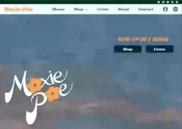
digital wireframes
Transitioning to digital wireframing, a key focus was the implementation of a top navigation bar designed to facilitate seamless user navigation. The homepage was strategically composed, featuring a visually compelling image with minimal text to highlight the current priority. Emphasis was placed on promoting upcoming events, with a dedicated section for show dates readily accessible upon scrolling down. This design choice ensures that users can easily access crucial information, promoting a user-friendly experience.

Promotional image and text to showcase upcoming events
Showdates made convenient to access by the user on the main page
digital wireframes screen size variations
desktop
mobile

low-fidelity prototype (desktop)
The foundation of the lo-fi prototype is built upon a primary flow, enabling users to seamlessly navigate through each section presented in the top navigation bar. Additionally, users can easily explore the merchandise section, add items to their cart, and proceed through the checkout process. This streamlined user journey ensures a clear and intuitive experience, focusing on essential functionalities in the early stages of the prototype.

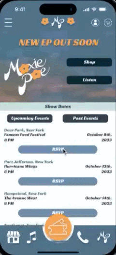
low-fidelity prototype (mobile)
The lo-fi prototype establishes a foundational user flow, enabling seamless exploration of each section within the top navigation bar. Users can effortlessly browse through merchandise, add items to their cart, and seamlessly proceed through the checkout process. This prioritized user journey ensures an intuitive experience, emphasizing key interactions in the early stages of the prototype development.

usability study: parameters
01.
study type:
Unmoderated usability study
02.
location:
United States, Remote
03.
participants:
5
04.
length:
20-30 min
usability study: findings
01.
Enhanced Navigation:
Participants expressed a preference for larger buttons to facilitate easier navigation, emphasizing the need for a more user-friendly interface.
02.
Accessible Cart:
The study revealed a consensus among users for an easily accessible cart feature, underscoring the importance of seamless and convenient access to the shopping cart.
03.
Detailed Product Information:
Users indicated a desire for an option to view comprehensive product details and sizing charts, emphasizing the need for a more informative and user-centric product presentation.
mockups
Using the insights from the usability study, I made changes regarding button size and placement. I rearranged the layout of show dates and times to allow for a less crowded UI and to make the RSVP button easier to click.
before usability study

after usability study

I also included product details and sizing charts while viewing mobile products to help improve user experience.
before usability study

after usability study

After the usability study, I also made the cart more accessible for the user. Instead of a pop out when an item is added to the cart, the cart slides out from the right side, and can be accessed throughout the site.
before usability study

after usability study

mockups: desktop


mockups: mobile


high-fidelity prototype (desktop)
The final high-fidelity prototype maintains the user flow established in the lo-fi version, allowing users to seamlessly navigate through sections, add items to their cart, and proceed to checkout. Incorporating essential design modifications identified in the usability study, this iteration ensures a refined and user-centric experience.


accessibility considerations
01.
High-Contrast Colors:
Employed colors with high contrast to enhance readability, prioritizing an accessible reading experience.
02.
Text Hierarchy for Navigation: Implemented a text hierarchy system to facilitate navigation, aiding users in easily discerning and prioritizing content.
03.
Accessible Iconography:
Utilized accessible iconography to assist users in identifying and comprehending content efficiently.
takeaways
impact
The Moxie Poe Website exemplifies the effective integration of user experience principles, providing visitors with a smooth journey to discover information, connect, and embrace a slice of Moxie's distinctive brand. Prioritizing accessibility and reflecting the artist's vision, this project establishes a digital presence that resonates with the vibrancy and creativity of Moxie Poe's musical identity.
what i learned
Learning from this project underscores the significance of a clear and concise user interface. Rather than replicating the desktop layout on mobile by cluttering buttons, the approach of creating a new layout tailored to mobile frame dimensions proves more effective. This insight emphasizes the importance of adaptability and user-centric design for optimal user experiences across different devices.
next steps
01
Usability Studies Redux:
Conduct another round of usability studies to gain deeper insights into user navigation within the interface.
02
Information Update and Integration:
Update information relevant to the artist's needs and seamlessly integrate it into the new layout.
03
Feature Ideation:
Generate ideas for additional features that could enhance the overall user experience and prove beneficial to the project.